Overview
Presentation and features of a page should depend on the device (desktop, tablet,
mobile, print).
Differences: bandwidth, screen width/height, orientation, pointer precision, and
script support.
For small screens, resize, reposition, crop, remove/hide or completely redesign
content/features.
For mobile, reduce number and sizes of images and files, but increase button and
link sizes.
Assure that images and elements are no wider than the screen: img { max-width: 100%;
}
http://coding.smashingmagazine.com/2011/01/12/guidelines-for-responsive-web-design/
http://www.abookapart.com/products/responsive-web-design
- book
http://denver2012.drupal.org/sites/default/files/aResponsiveProcess.pdf
- links at end
http://www.slideshare.net/RZasadzinski/responsive-web-design
- presentation
Mobile-first design
Take advantage of mobile's explosive growth and new features, and focus on users'
main needs.
http://www.lukew.com/ff/entry.asp?933
- quick justification
http://www.slideshare.net/RZasadzinski/mobile-is-the-new-godzilla-july-2011-fcip
- presentation
http://denver2012.drupal.org/keynote/luke-wroblewski
- one-hour presentation
http://www.abookapart.com/products/mobile-first
- short book with design tips
Media queries
http://www.w3.org/TR/css3-mediaqueries/
http://zomigi.com/blog/essential-considerations-for-crafting-quality-media-queries/
A media query uses device properties to determine which stylesheet or set of style
rules to load.
media - the device type (all, screen,
print, etc.); recent mobile devices do not support
handheld
width and height - the device screen dimensions,
often prefixed with min- or max- and device-
orientation, aspect-ratio, color,
resolution (pixel density), etc. - less frequently used properties
Make the mobile styles the default so old mobile browsers see correct styles and
perform best.
Make logical breakpoints based on your content vs. on a large, changing set of specific
devices.
Embedded media queries vs. external stylesheets
Embedded media queries require fewer HTTP requests and produce faster page loads.
@fmedia only screen and (max-width: 768px) { body { width: 100%; … } … }
External stylesheets can separate and minimize CSS code for each device category.
<link rel="stylesheet" href="phone.css" media="only screen">
<link rel="stylesheet" href="tablet.css" media="only screen and (min-width: 500px)
and (max-width: 500px)">
<link rel="stylesheet" href="desktop.css" media="only screen and (min-width:
769px)">
<link rel="stylesheet" href="print.css" media="print">
To load stylesheets in CSS instead of link tags in HTML, you can use @fimport
statements, though they reduce performance.
@fimport("desktop.css") only screen and (min-width: 769px);
Cascading vs. mutually exclusive media queries
Overlapping queries reduce repeated code for fast page loads, consistency and easy
maintenance.
Non-overlapping media queries allow more complex, distinct designs for each device
category.
Viewport for mobile devices
Include a meta viewport tag so that mobile devices use their device width as their viewport width and display mobile-optimized CSS.
<meta name="viewport" content="width=device-width, initial-scale=1">
Support for Internet Explorer 5-8 and other old browsers
http://coding.smashingmagazine.com/2011/08/10/techniques-for-gracefully-degrading-media-queries/
- https://github.com/scottjehl/Respond - lightweight but basic (only supports min-width and max-width)
- http://code.google.com/p/css3-mediaqueries-js/ - slower but more complete feature support
Dreamweaver tools
Tutorials by Adobe
http://tv.adobe.com/watch/cs-55-web-premium-feature-tour-/updated-support-for-css3/
http://www.adobe.com/devnet/dreamweaver/articles/dw_html5_pt1.edu.html
http://www.adobe.com/devnet/dreamweaver/articles/dw_html5_pt2.edu.html
http://www.adobe.com/devnet/dreamweaver/articles/dw_html5_pt3.edu.html
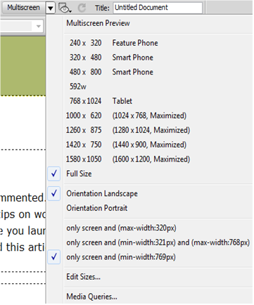
Multiscreen preview and Window Size
To see how a page looks in different browser windows, click the Multiscreen menu in the Dreamweaver Document toolbar, and select a size, or click Multiscreen Preview for multiple sizes in one popup window.
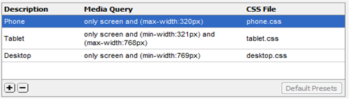
Media Queries dialog box
To create your own media queries, select Media Queries… from the
the Multiscreen menu. Click the Default Presets button for an example.
Name a CSS file for each device type.
Mobile development
Dreamweaver provides some built-in tools for mobile application development. These
are useful for organizations with the time and resources to develop separate mobile
and non-mobile sites:
New Document > Page from Sample > Mobile Starters > jQuery Mobile
Site > Mobile Applications > Build and Emulate > (PhoneGap for Android
and iOS)